
Picture this: you walk into your bedroom after a long day, and instead of chaos, you’re greeted by a space so serene it feels like a warm hug. That’s the magic of Scandinavian bedroom color palettes – they don’t just look good, they make you feel good.
I’ve spent years obsessing over Nordic design (maybe too many late nights scrolling through Swedish interiors), and here’s what I’ve learned: getting the best palettes for Scandi bedrooms isn’t about following rigid rules. It’s about creating a space that whispers rather than shouts, where every color choice serves a purpose beyond just looking pretty.
Why Scandinavian Bedroom Color Schemes Work So Well
Before we dive into specific palettes, let’s talk about why Scandi bedroom colors have become the gold standard for peaceful spaces. These neutral bedroom color schemes aren’t just trendy – they’re rooted in practicality.
Light and neutral colors serve multiple purposes in Scandinavian design. They reflect precious natural light (crucial when you’re dealing with those short Nordic winters), make rooms feel more spacious, and create what I like to call “visual breathing room.” Your eyes aren’t constantly jumping from one bold element to another – instead, they can rest.
But here’s where it gets interesting: modern Scandinavian style bedroom colors aren’t afraid of personality. Sure, the foundation stays neutral, but today’s Scandi spaces incorporate accent colors that would make your grandmother’s all-beige bedroom weep with envy.
Want to know how Scandinavian style compares to other aesthetics? Take a look at our guide on modern vs vintage bedroom decorating ideas for some contrast and inspiration.
The 8 Best Color Palettes for Your Scandi Bedroom
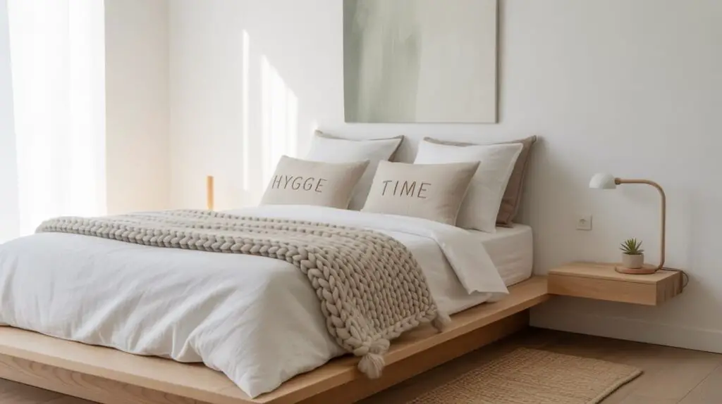
1. The Classic Foundation: Whites and Warm Grays
Let’s start with the bread and butter of minimalist bedroom colors. This palette combines crisp whites with soft, warm grays – think the color of morning mist over a Swedish lake.
Key Colors:
- Pure white or off-white for walls
- Warm gray (like Benjamin Moore’s “Classic Gray”) for accents
- Natural wood tones for furniture
Why it works: This calm bedroom color palette reflects maximum light while maintaining warmth. It’s like wearing a perfectly tailored white shirt – classic, versatile, and always appropriate.
Pro tip: Layer different shades of white and gray through textiles. A cream throw, white sheets, and gray pillows create depth without visual chaos.
2. Soft Pastels: The Gentle Giant
Who said soft pastel bedroom palettes couldn’t be sophisticated? This scheme introduces whisper-soft colors that add personality without overwhelming your senses.
Key Colors:
- Pale blue (think “Swedish sky after rain”)
- Dusty pink (rose quartz vibes)
- Sage green (like eucalyptus leaves)
- Cream base
Application: Use the 60:30:10 rule here – 60% neutral base, 30% soft pastel accents through bedding and curtains, and 10% vibrant touches in artwork or pillows.
This palette works beautifully in small bedrooms because pastels maintain the light-reflecting properties of neutrals while adding visual interest.
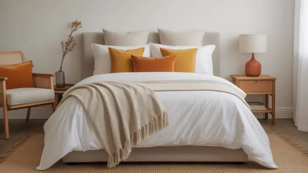
3. The Modern Twist: Bold Accents on Neutral Base
Here’s where Scandinavian bedroom design gets rebellious. This palette keeps the neutral foundation but isn’t shy about adding personality through strategic bold colors.
Key Colors:
- White or light gray base
- Mustard yellow accents (think Swedish marigolds)
- Burnt orange touches
- Natural wood elements
How to nail it: Keep bold colors to accessories and small furniture pieces. A mustard yellow throw pillow or burnt orange ceramic lamp can completely transform a neutral space without commitment.
4. Nature’s Palette: Forest and Stone
This natural wood bedroom colors scheme draws inspiration directly from Scandinavian forests. It’s earthy without being heavy, sophisticated without being pretentious.
Key Colors:
- Mushroom gray
- Forest green (muted, not bright)
- Warm beige
- Rich wood tones (oak, birch, or ash)
The secret sauce: Balance is everything here. Too much green and you’ll feel like you’re sleeping in a forest (which might sound appealing until 3 AM). Keep green to accent pieces and let the wood tones carry the natural theme.
5. The Monochrome Magic: Black, White, and Everything Between
Don’t sleep on black and white contrasts in Scandinavian design. This palette is for those who appreciate drama within minimalism – like a perfectly tailored tuxedo in bedroom form.
Key Colors:
- Pure white base
- Charcoal or deep gray accents
- Black details (frames, hardware, textiles)
Execution: Use black sparingly but strategically. A black iron bed frame against white walls creates stunning contrast without overwhelming the space. Add gray textiles to soften the stark contrast.
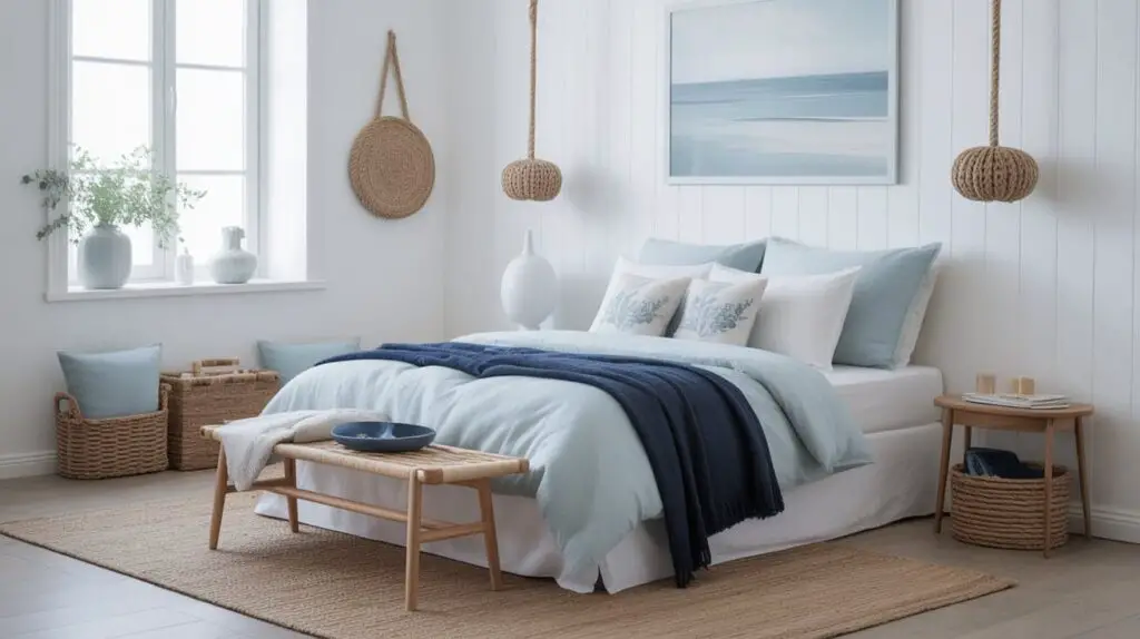
6. Coastal Scandi: Blues and Whites
This palette channels those dreamy Swedish archipelago vibes. Pastel blue in Scandinavian bedroom design doesn’t have to feel childish – when done right, it’s sophisticated and calming.
Key Colors:
- Soft white base
- Pale blue (like sea glass)
- Light gray
- Natural rope or jute accents
Pro styling tip: Layer different shades of blue through textiles. A navy throw blanket, pale blue sheets, and white pillows create a cohesive coastal feel without screaming “beach house.”
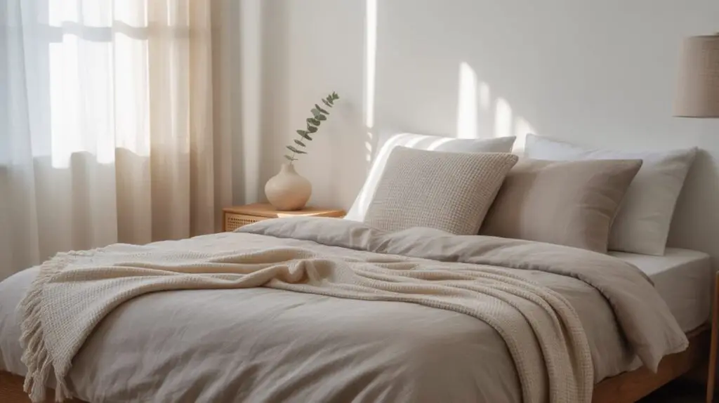
7. Warm Minimalism: Creams and Taupes
This cozy bedroom color idea is perfect if stark white feels too clinical for your taste. It maintains the Scandinavian principle of neutrality while adding warmth that makes you want to hibernate.
Key Colors:
- Warm cream or mushroom white
- Taupe and beige accents
- Natural linen colors
- Honey-colored wood
The magic: This palette works exceptionally well with cozy textiles like chunky knit throws, linen bedding, and wool rugs. It’s minimalism with a hug.
8. The Contemporary Edge: Sage and Neutrals
Sage green in Scandinavian bedroom palettes has become the color du jour, and for good reason, it’s also one of the standout colors featured in our list of 2025’s top bedroom decoration trends. It’s calming like blue but more grounded, fresh like green but more sophisticated.
Key Colors:
- Soft white or cream base
- Sage green accents
- Warm gray touches
- Natural wood elements
Application: Use sage green in larger textile pieces like a duvet cover or curtains, then echo it in smaller accessories like plants (real ones, obviously – fake plants are the antithesis of Scandinavian authenticity).
How to Apply These Palettes: The Technical Stuff
The 60:30:10 Rule in Practice
This isn’t just design school jargon – it actually works. Here’s how to apply it:
- 60% (Dominant): Your walls, flooring, and large furniture pieces
- 30% (Secondary): Bedding, curtains, rugs, and medium furniture
- 10% (Accent): Artwork, pillows, lamps, and decorative objects
| Element | Percentage | Example Items |
|---|---|---|
| Base Colors | 60% | Walls, flooring, bed frame |
| Secondary Colors | 30% | Bedding, curtains, chair |
| Accent Colors | 10% | Pillows, artwork, plants |
Need help choosing what furniture counts as foundational? Explore our list of the 12 essential furniture pieces every stylish master bedroom needs.
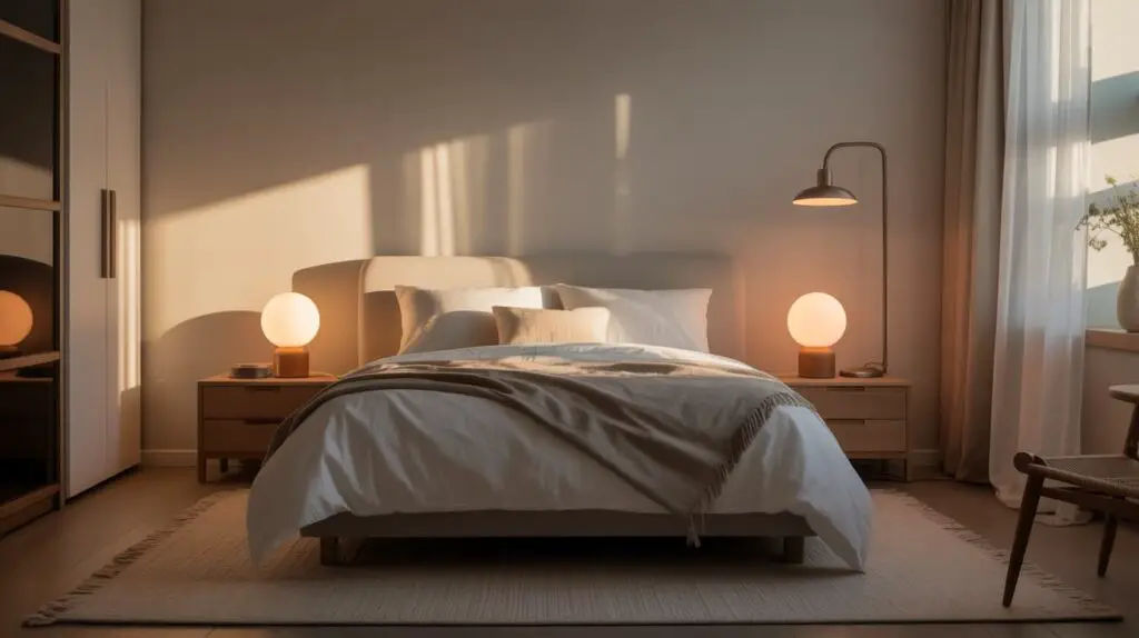
Lighting: The Unsung Hero
Scandinavian bedroom lighting ideas aren’t just about fixtures – they’re about enhancing your color palette. Warm, adjustable lighting brings out the cozy elements in neutral palettes while cooler light can make pastels pop.
Must-have lighting:
- Table lamps with warm bulbs (2700K-3000K)
- Floor lamps for ambient lighting
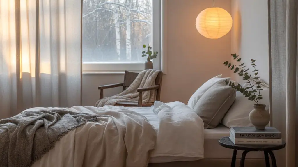
- Natural light maximization through sheer curtains
Try the HAITRAL Wooden Tripod Bedside Lamp, whose natural wood and linen shade beautifully echo Scandi minimalism and deliver cozy, ambient glow.
Making It Work in Small Spaces
Scandinavian color palette for small bedrooms follows the same principles with extra attention to light reflection. Light colors bounce light around, making spaces feel larger than they are.
Small space strategies:
- Stick to 2-3 colors maximum
- Use mirrors strategically to reflect natural light
- Choose furniture with visible legs (creates visual space underneath)
- Keep accent colors to small, moveable pieces
Common Mistakes to Avoid
After years of helping people create their dream Scandinavian bedrooms, I’ve seen these mistakes repeatedly:
For a deeper dive into what to steer clear of, check out our full guide on the most common bedroom decor mistakes you might be making.
The “Too Perfect” Trap: Scandinavian design isn’t about creating a museum. Add personal touches that reflect your personality – family photos, books, or that vintage lamp you inherited from your aunt.
Ignoring Texture: Color isn’t everything. Layering textures in a Scandi bedroom is crucial. Smooth wood, nubby wool, soft linen, and cool metal create visual interest even within a neutral palette.
Forgetting the 10%: That accent percentage is what prevents your room from feeling like a high-end psychiatric facility. Don’t skip it.
Seasonal Palette Adjustments
Here’s something most guides won’t tell you: your Scandinavian-inspired bedroom textile colors can shift with the seasons without abandoning the core aesthetic.
Summer: Introduce lighter blues, more white, and natural fiber textures Winter: Add deeper grays, mustard accents, and cozier wool textures Spring: Soft pinks, sage greens, and fresh white linens Fall: Warm taupes, rust accents, and richer wood tones
The Bottom Line: Creating Your Perfect Scandi Sanctuary
The best palettes for Scandi bedrooms aren’t about following rules religiously – they’re about understanding the principles and adapting them to your life. Whether you’re drawn to the classic white-and-gray foundation or ready to experiment with sage green accents, the key is maintaining that sense of calm and intentionality that makes Scandinavian design so appealing.
Remember, your bedroom should be a reflection of you, just filtered through the lens of Scandinavian sensibility. It’s less “what would a Swedish designer do?” and more “how can I create a space that helps me sleep better and wake up happier?”
Your next steps:
- Choose one palette from this list that resonates with you
- Start with paint – it’s the biggest visual impact for the least money
- Build your textiles around your chosen colors
- Add personality through the 10% accent rule
- Step back and enjoy your perfectly imperfect Scandinavian sanctuary
The beauty of Scandinavian design isn’t in its perfection – it’s in its ability to make everyday life feel a little more peaceful, a little more intentional, and a lot more beautiful. Now go create that dreamy bedroom you’ve been scrolling past on Instagram for months. Your future well-rested self will thank you.
Looking to tie these palettes into a full bedroom makeover? Browse more tips and inspiration in our bedroom decorating hub.
Pingback: Love Small Spaces? These 12 Bedroom Trends Are for You - honeydwelling.com